How can I change the background color of a checkbox using CSS? I have tried using the ‘background-color’ property, but it does not seem to work. Is there another way to change the background color of a checkbox? Like a specific CSS property or class, I can use to target the checkboxes and apply a background color to them?
You can use the new accent-color property to change the background color of the checkbox for the latest browsers.
input[type="checkbox"] {
    accent-color: red;
}
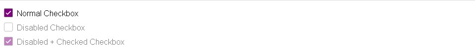
But for old browsers, there is no native way to add a background color. You can do some CSS hacks to achieve your goal.
HTML
<label>
  <input type="checkbox">
  <span>Normal Checkbox</span>
</label>

<br>

<label>
  <input type="checkbox" disabled>
  <span>Disabled Checkbox</span>
</label>

<br>

<label>
  <input type="checkbox" checked disabled>
  <span>Disabled + Checked Checkbox</span>
</label>
CSS
<style type="text/css">
	input[type="checkbox"] {
	  position: absolute;
	  opacity: 0;
	  z-index: -1;
	}

	input[type="checkbox"]+span {
	  cursor: pointer;
	  font: 16px sans-serif;
	  color: black;
	}

	input[type="checkbox"]+span:before {
	  content: '';
	  border: 1px solid grey;
	  border-radius: 3px;
	  display: inline-block;
	  width: 16px;
	  height: 16px;
	  margin-right: 0.5em;
	  margin-top: 0.5em;
	  vertical-align: -2px;
	}

	input[type="checkbox"]:checked+span:before {
	  background-image: url("data:image/svg+xml,%3Csvg xmlns='http://www.w3.org/2000/svg' viewBox='0 0 512 512' xml:space='preserve' style='fill: %23fff;'%3E%3Cpath d='M362.6,192.9L345,174.8c-0.7-0.8-1.8-1.2-2.8-1.2c0,0,0,0,0,0c-1.1,0-2.1,0.4-2.8,1.2l-122,122.9L173,253.3 c-0.8-0.8-1.8-1.2-2.8-1.2c-1,0-2,0.4-2.8,1.2l-17.8,17.8c-1.6,1.6-1.6,4.1,0,5.7l56,56c3.6,3.6,8,5.7,11.7,5.7 c5.3,0,9.9-3.9,11.6-5.5c0,0,0,0,0.1,0l133.7-134.4C364.1,196.9,364.1,194.4,362.6,192.9z'/%3E%3C/svg%3E%0A");
	  background-repeat: no-repeat;
	  background-position: center;
	  background-size: 25px;
	  border-radius: 2px;
	  background-color: purple;
	  color: white;
	}


	input[type="checkbox"]:focus+span:before,
	input[type="checkbox"]:not(:disabled)+span:hover:before {
	  box-shadow: 0px 0px 0px 2px rgba(0, 150, 255, 1);
	  outline-color: transparent;
	  outline-width: 2px;
	  outline-style: dotted;
	}
	input[type="checkbox"]:disabled+span {
	  cursor: default;
	  color: black;
	  opacity: 0.5;
	}
</style>
You will get something like this.