I ran into a surprisingly common problem while working on a few WordPress sites: the page looked great on screen, but the printed version was a mess. That’s where CSS print styles come in. With a little setup, you can make your site look clean and readable on paper—without messing up your normal screen design.
- The problem I faced with printing web pages
- How print CSS works
- Option 1: Add a dedicated print stylesheet
- Option 2: Use @media print for small changes (no extra file)
- Practical print CSS ideas you’ll actually use
- Troubleshooting
- My print styles aren’t applying
- Backgrounds and colors aren’t printing
- The layout looks squeezed or breaks across pages
- Official references
- Related guides
- Wrap-up
In this post, I’ll show you two practical ways to handle printing styles:
- Add a separate print stylesheet (best for bigger changes)
- Use
@media printrules (perfect for small tweaks)
The problem I faced with printing web pages
Most sites are built for screens: flexible layouts, big navigation menus, colorful backgrounds, buttons, sidebars, and sometimes animations. But printers don’t care about any of that. When you hit Ctrl/Cmd + P, you often get:
- Navigation menus wasting half the page
- Background colors printing poorly (or not at all)
- Text too small or too light
- Links that become useless because you can’t “click” paper
- Sidebars and widgets cluttering the printout
I didn’t want the print version to be a screenshot of the screen version. I wanted it to feel like a document: readable font, clean spacing, and no unnecessary sections. The good news: CSS already has a built-in way to target print layouts.
How print CSS works
Browsers support different “media types” for CSS. The big ones you’ll use are:
- screen — normal viewing in a browser
- print — print preview / printed page
- all — applies everywhere
That means you can tell the browser: “Use these rules only when printing.” There are two main approaches.
Option 1: Add a dedicated print stylesheet
If you expect a lot of print-specific styling (hiding multiple sections, restructuring layouts, changing fonts, etc.), a separate CSS file is clean and maintainable.
Step-by-step: Link a print CSS file
Add this inside your <head> tag:
<link rel="stylesheet" type="text/css" media="print" href="printer.css">Quick notes:
media="print"targets only print preview and printing.- For screen-only CSS you can use
media="screen". - For both screen and print (rarely needed these days), use
media="all".
Then inside printer.css, you can add print-friendly rules like hiding headers, menus, or sidebars.
Option 2: Use @media print for small changes (no extra file)
Sometimes you don’t want another file—maybe you only want to change a font, reduce spacing, or hide one section. In that case, CSS print styles using a media query are the fastest solution.
Step-by-step: Add a print media query
You can place this inside a <style> tag in your HTML, or (better) inside your main stylesheet:
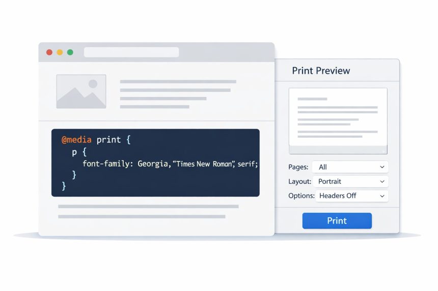
<style type="text/css">
  @media print {
    p { font-family: Georgia, "Times New Roman", serif; }
  }
</style>
That rule says: “When printing, apply this font to paragraphs.” You can swap in any print-friendly styles you need.
Screen-only media query
If you want rules only for normal browsing:
<style type="text/css">
  @media screen {
    p { font-family: system-ui, -apple-system, Segoe UI, Roboto, Arial, sans-serif; }
  }
</style>
Both screen and print
If you want a shared rule for both:
<style type="text/css">
  @media screen, print {
    p { font-family: Georgia, "Times New Roman", serif; }
  }
</style>
Personally, I prefer keeping “shared” rules outside media queries and using media queries only for differences. It keeps things simpler.
Practical print CSS ideas you’ll actually use
Once you start using CSS print styles, these are the most common improvements:
- Hide navigation and sidebars: Menus, widgets, footers often don’t belong on paper.
- Improve typography: Use a readable serif font, increase line-height, avoid light colors.
- Show link URLs: Printed pages can’t click links, so showing the URL can help.
- Remove backgrounds: Many browsers don’t print backgrounds by default anyway.
Here’s a sample you can adapt:
@media print {
  /* Hide common clutter */
  header, nav, aside, footer {
    display: none !important;
  }

  /* Make text more readable */
  body {
    font-family: Georgia, "Times New Roman", serif;
    font-size: 12pt;
    line-height: 1.5;
    color: #000;
  }

  /* Prevent printing weird colors */
  * {
    background: transparent !important;
    box-shadow: none !important;
  }

  /* Optional: show URLs after links */
  a[href]:after {
    content: " (" attr(href) ")";
    font-size: 10pt;
  }
}
You don’t need all of this every time—but these patterns cover most real-world print problems.
Troubleshooting
My print styles aren’t applying
- Make sure you’re testing in the browser’s print preview (not just resizing the screen).
- If you used
media="print", confirm the file path to the CSS is correct. - Use
!importantin print rules if your normal CSS is overriding them. - Check if you placed the
@media printblock inside a broken<style>tag or missing braces.
Backgrounds and colors aren’t printing
This is often a browser setting. Many browsers disable printing background graphics by default. Print CSS can help, but user settings still matter. When in doubt, design print layouts that don’t rely on backgrounds.
The layout looks squeezed or breaks across pages
Try reducing widths, removing floats/grids for print, and controlling page breaks:
@media print {
  .container {
    width: 100% !important;
    max-width: 100% !important;
  }

  h2, h3, p {
    page-break-inside: avoid;
  }
}
Official references
Related guides
(Add your internal links here when you have them. Example ideas below.)
- How to add custom CSS in WordPress (Gutenberg + theme options)
- How to optimize CSS delivery for performance
- Common CSS debugging tips (specificity, cascade, and DevTools)
Wrap-up
Once I started using CSS print styles, printing stopped being an afterthought and started feeling intentional. If you need full control, use a dedicated print stylesheet. If you just need a small tweak, drop in an @media print block and move on with your day.