
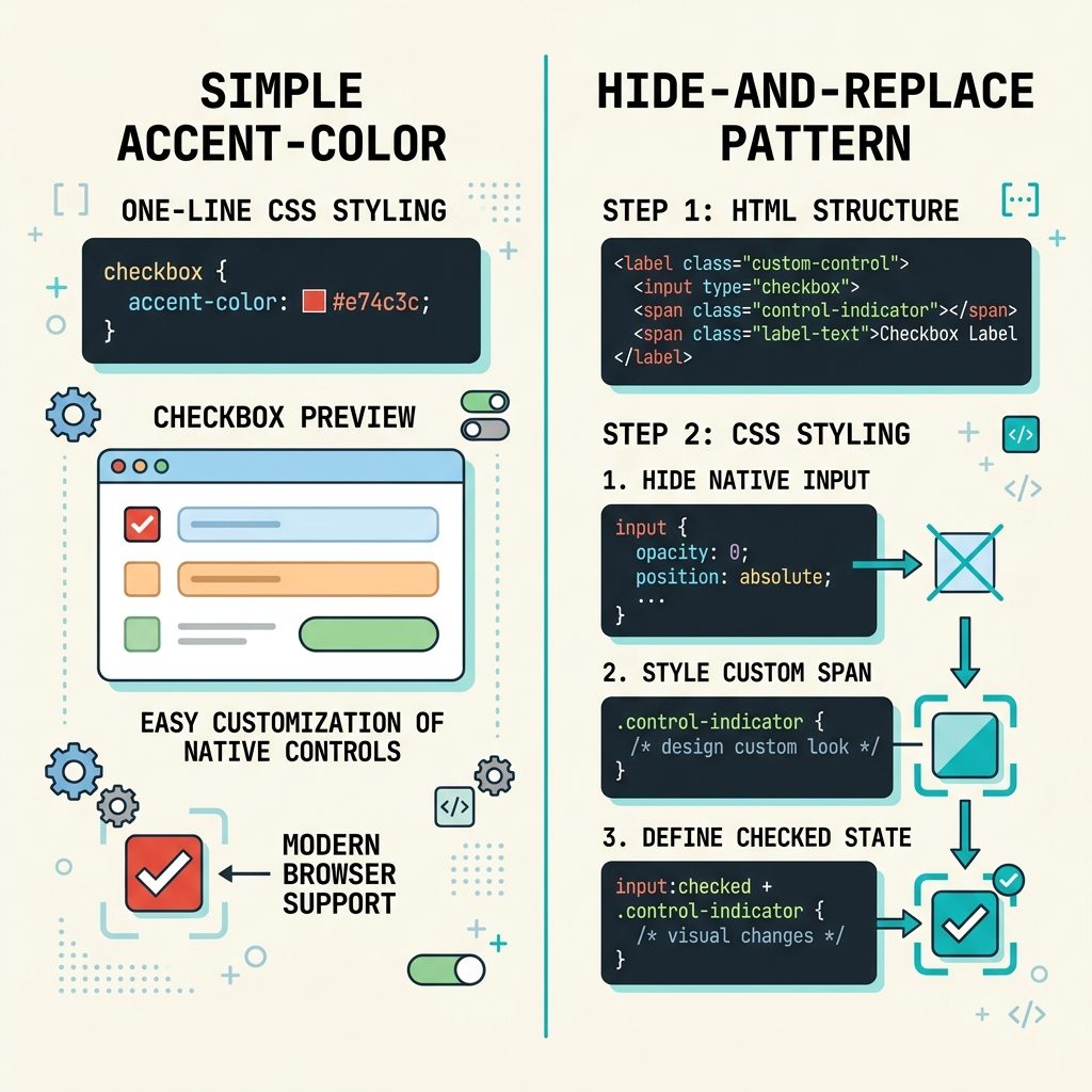
To change a checkbox background color with CSS, the modern one-liner is accent-color: red. Every browser since 2022 supports it. For finer control (custom shape, gradient, animation) or older browser support, the classic pattern is to visually hide the native checkbox and draw a replacement with a <span>. This guide covers both, with full accessibility-preserving HTML.
Last verified: 2026-05-17 in Chromium, Firefox, and Safari. Originally published 2023-01-04, rewritten and updated 2026-05-17.
TL;DR — modern browsers
input[type="checkbox"] {
  accent-color: #d32f2f;   /* the "fill" color when checked */
}
That’s it. The browser paints checked-state checkboxes in your color, on every form. Works in Chrome/Edge 93+, Firefox 92+, Safari 15.4+. Also applies to radio buttons, progress bars, and range sliders.
Fallback — hide native, draw a replacement
When you need any of these — gradient fill, custom shape, animated transitions, support for old browsers — visually hide the real checkbox and draw a replacement with a sibling element:
<label class="cb">
  <input type="checkbox">
  <span class="cb-visual"></span>
  <span class="cb-text">Accept terms</span>
</label>
.cb input[type="checkbox"] {
position: absolute;
opacity: 0;
width: 1px; height: 1px; /* still focusable */
}
.cb-visual {
display: inline-block;
width: 18px; height: 18px;
border: 2px solid #888;
border-radius: 4px;
background: #fff;
vertical-align: middle;
transition: background 0.15s, border-color 0.15s;
}
/* Checked state — flip the visual */
.cb input[type="checkbox"]:checked + .cb-visual {
background: #d32f2f;
border-color: #d32f2f;
}
/* Focus ring on the visual when the real input is focused */
.cb input[type="checkbox"]:focus-visible + .cb-visual {
outline: 2px solid #1e88e5;
outline-offset: 2px;
}
/* Optional checkmark using ::after */
.cb input[type="checkbox"]:checked + .cb-visual::after {
content: "";
display: block;
width: 6px; height: 10px;
margin: 1px auto;
border: solid #fff;
border-width: 0 2px 2px 0;
transform: rotate(45deg);
}Key points: opacity: 0 hides the native input but keeps it focusable (don’t use display: none, which removes it from the tab order). The <label> wraps both so clicking the visual replacement toggles the real checkbox underneath. The :focus-visible rule keeps the keyboard accessibility intact.
Frequently asked questions
background-color work on a checkbox? Because the native <input type="checkbox"> renders as a platform-native widget — Windows draws it via Common Controls, macOS via NSButton, Chromium via Skia. The browser ignores most CSS on it, including background-color, border-radius, and width/height on the check itself. accent-color is the one property modern browsers added specifically for this case.
accent-color have? All modern engines since around 2022: Chrome/Edge 93+, Firefox 92+, Safari 15.4+. For anything older — IE, legacy Edge, very old Android WebView — fall back to the hide-and-replace technique in this guide.
accent-color only accepts a single color, not gradients. For anything fancier (gradient fill, custom checkmark icon, animated transitions), you have to fall back to the hide-the-native-input pattern: visually hide the real checkbox, build the visual from a sibling <span> with full CSS control.
The native input is still in the DOM and reachable by keyboard and screen readers — you just hide it visually with opacity: 0 and position: absolute (don’t use display: none, which removes it from focus too). A <label> wraps both, so clicking the visual replacement toggles the real checkbox underneath.
accent-color also affect radio buttons and progress bars? Yes — it’s a single property that paints checkboxes, radio buttons, progress bars, and range sliders with the chosen color. Set it on the form (or even on :root) and every form control inside picks it up: :root { accent-color: #1e88e5; }.
Related guides
- How to Add the Required Attribute to Input Fields with jQuery
- How to Auto-focus a Select2 Dropdown on Page Load
References
MDN accent-color: developer.mozilla.org/en-US/docs/Web/CSS/accent-color.

![DataTables default sort order — order: [[1, 'desc']] config](https://www.how7o.com/wp-content/uploads/2026/05/datatables-default-sort-order-featured-150x150.jpg)